1 / 6
UX Researcher & Designer
4 Months
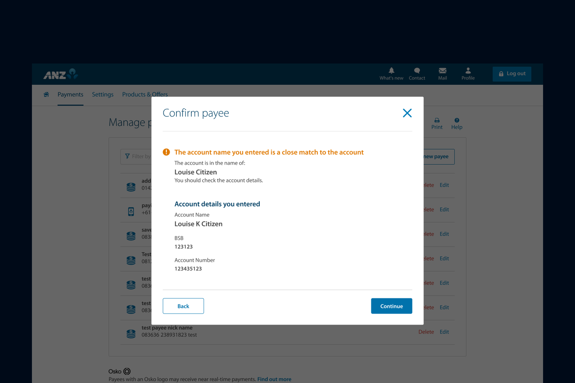
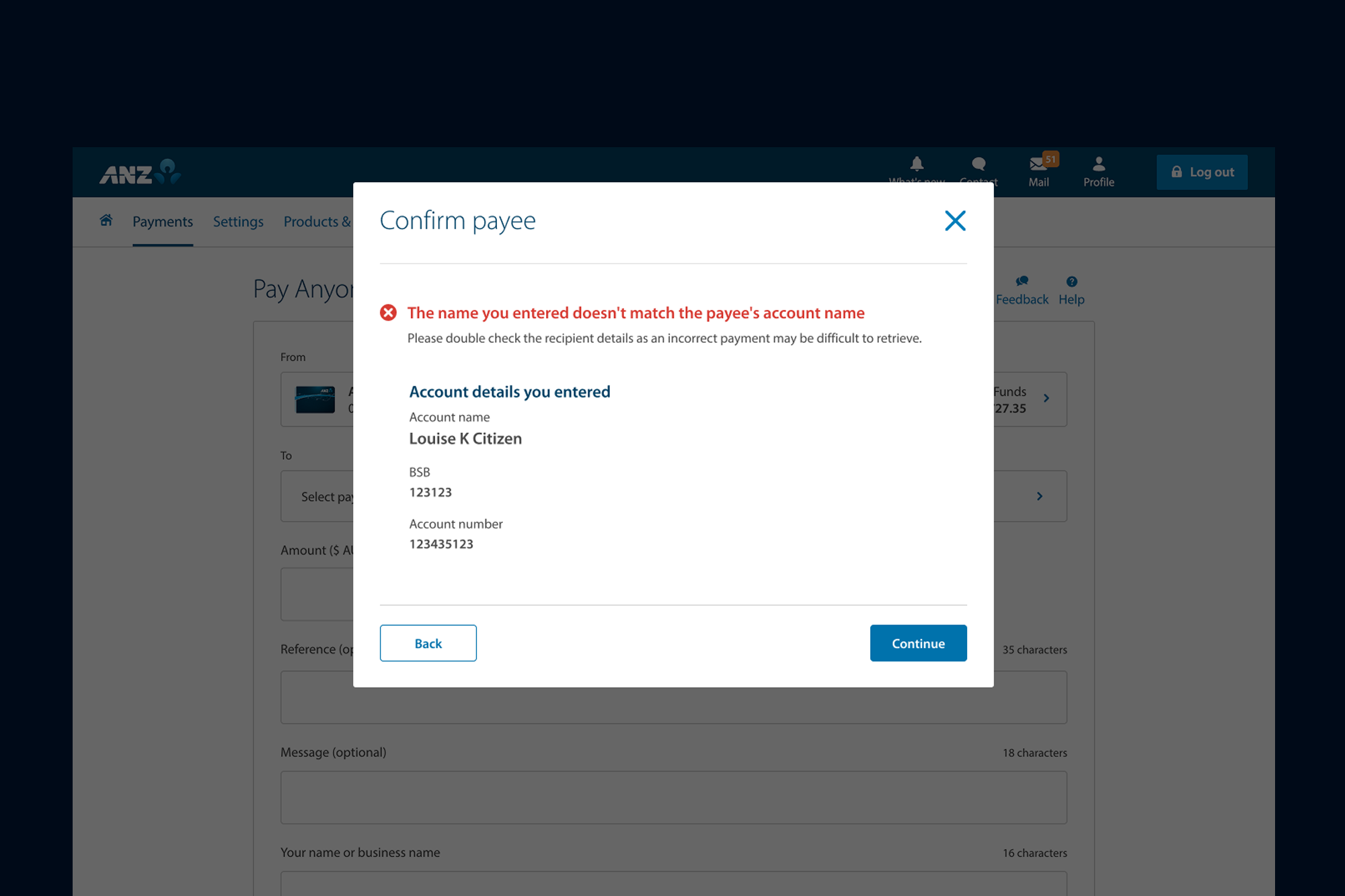
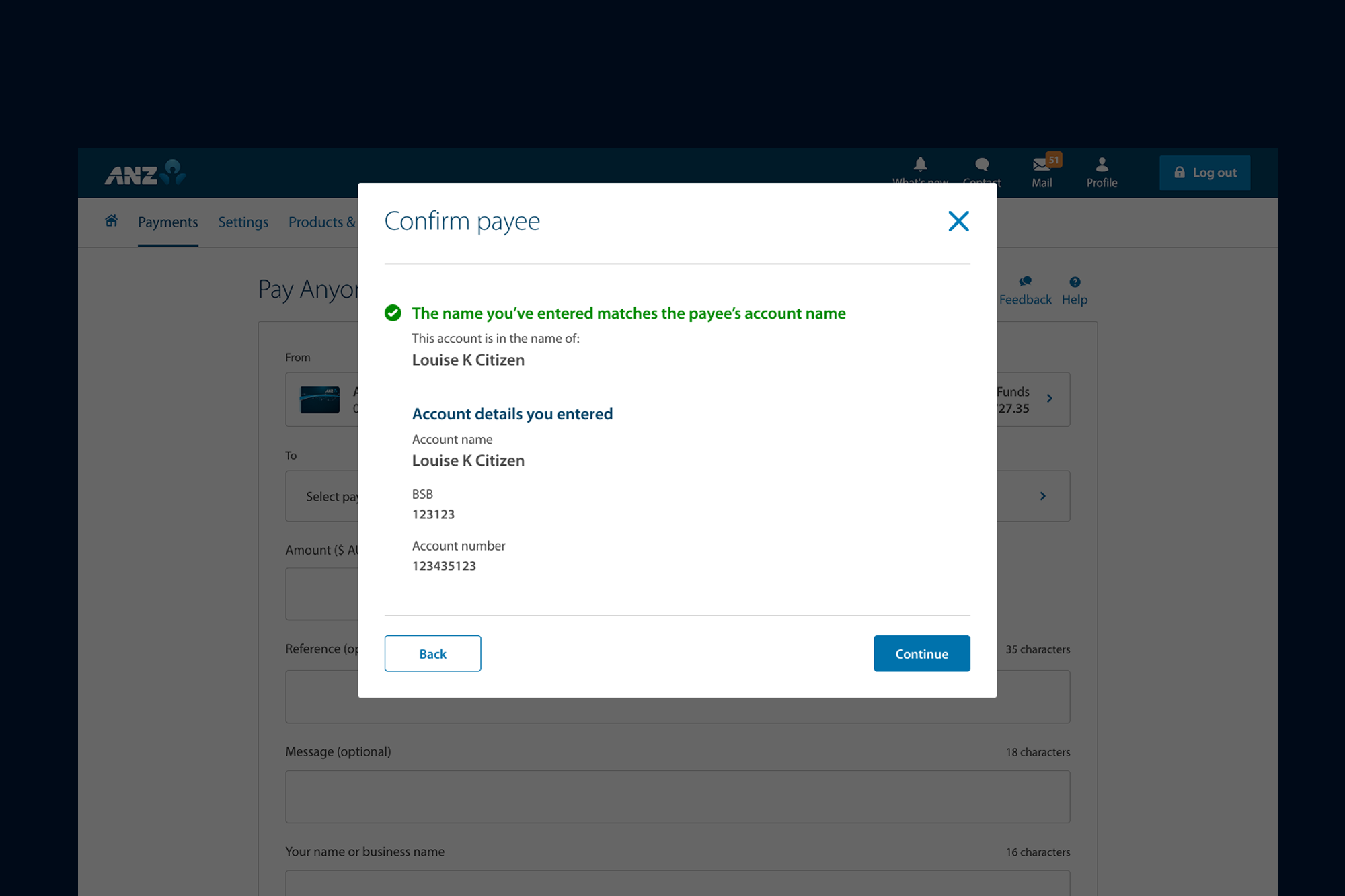
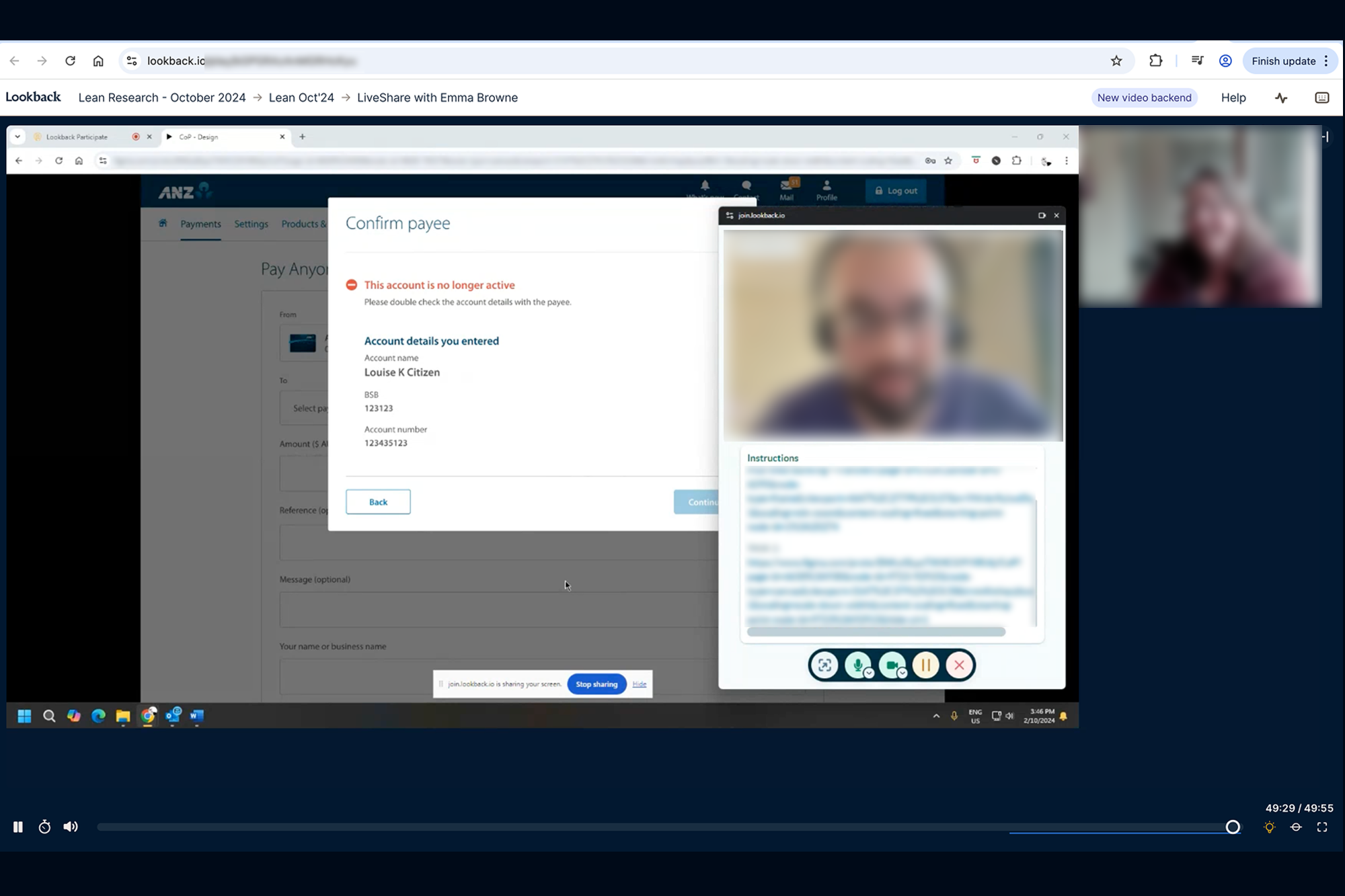
By implementing the Confirmation of Payee (CoP) feature, ANZ significantly reduced the risk of scams and mistaken payments by verifying that the payee's account name matches the receiving bank's records in real time.
Following the UX-led redesign, the product is now live with a seamless and friction-free experience for adding payees and transferring funds. This resulted in a 30% increase in successful transactions, a 40% improvement in user engagement during the payment journey, and a measurable uplift in customer confidence and satisfaction.
The real-time validation not only reduces errors but also reinforces trust, ensuring customers feel secure that their payments are reaching the intended recipient.
I translated broad conceptual models into precise interface designs, validating decisions at every stage of the process.
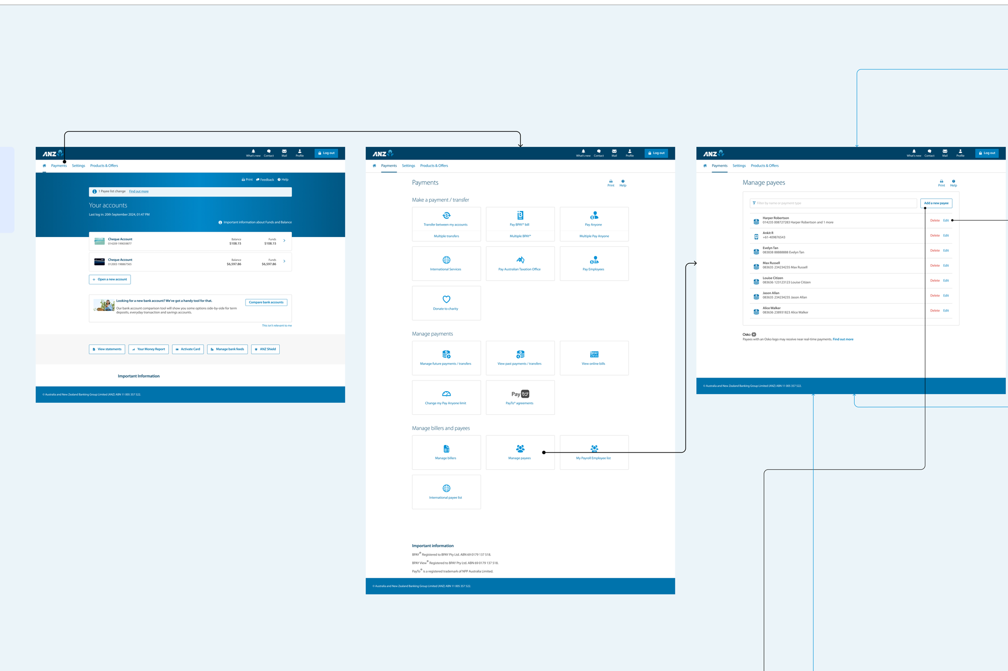
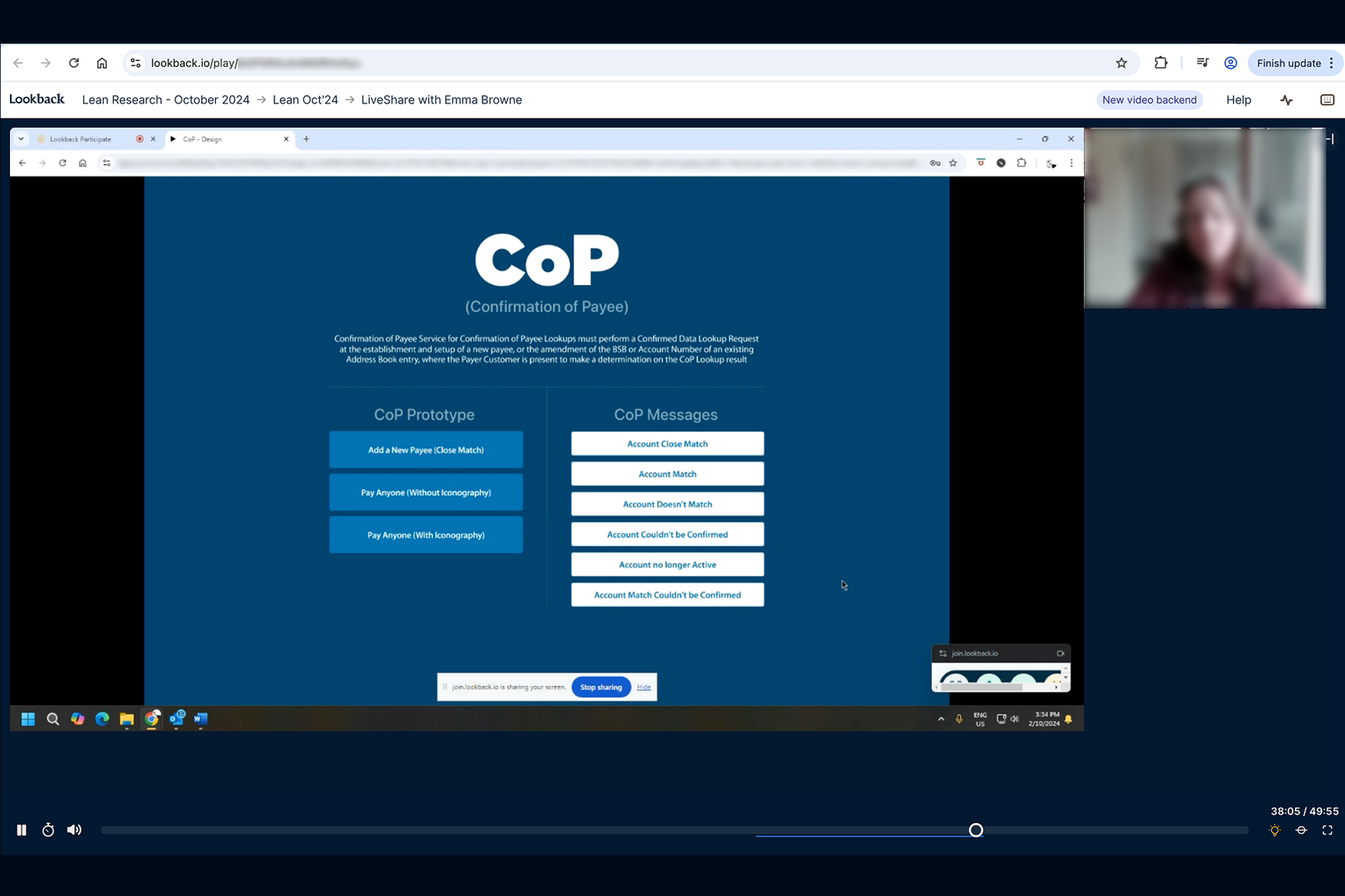
Designing the Confirmation of Payees (COP) experience was challenging due to limited access to local users, as ANZ does not operate in India and end users were based overseas. To address this, I coordinated with counterparts in Melbourne to conduct remote user testing. I shared prototypes with multiple scenarios, and testing was conducted with seven participants across different age groups and industries, including non-tech-savvy users. I later reviewed the recorded user-testing sessions from all participants, which helped identify key pain points, inform design iterations, and successfully deliver the final solution to stakeholders. The experience is now live.
Before touching pixels, I needed to understand the user's mental model. I recruited 20 participants for an open card sorting session. The key insight: Users categorize by "Task Frequency" rather than "Department".
I sketched a new navigation concept focusing on a 'Mega Menu' for rare tasks and a 'Quick Access' dashboard for daily workflows. This separated "Monitoring" from "Management" functions.
To ensure no dead-ends, I mapped out the entire reporting generation flow. The goal was to prove that a user could get from "Dashboard" to "Export PDF" in under 3 clicks.

We A/B tested the new navigation against the old one. The new structure showed a clear 40% reduction in time-to-value. Users reported feeling 'less overwhelmed'.
I don't just hand over screens; I hand over logic. My final delivery included a component-based breakdown and detailed behavior specs for developers.